
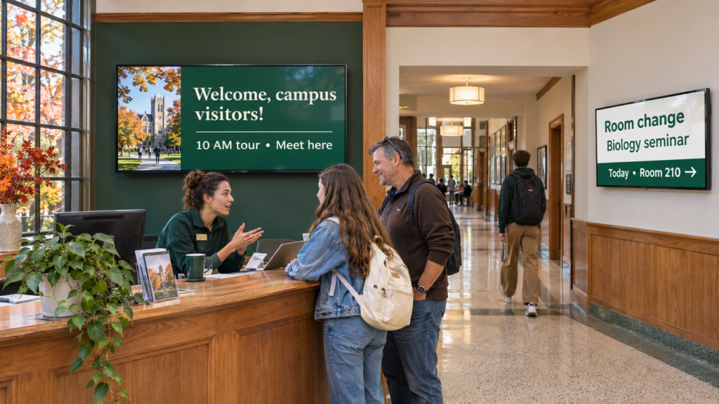
Start with 1 welcome screen and 1 hallway screen, each run by a named person, with an end date on every slide. Show event times, room changes and welcome messages first, and check the playlist once a week so nothing goes stale.
You’re the department coordinator, events office or admissions staffer who just got handed a TV and a to-do. You’re not planning a campus-wide network. You want the TV outside your office or inside your welcome center to be right on Monday and still right on Friday. Think of it as the corkboard outside your door, except you can fix a typo from your phone.
It’s a TV or display that shows information people used to find on paper. The University of Iowa’s IT office describes it as a technology that allows you to post information that would traditionally be on a bulletin board, on a digital display or TV. On campus that usually means event times, room changes, office hours, welcome messages and closures.
The difference from paper is how fast it changes. A flyer for Thursday’s event stays up until someone remembers to pull it down. A slide can have an end date, and it can be fixed from a desk or a phone.
That speed is also the risk. A TV nobody updates looks worse than an empty corkboard, because it advertises that nobody’s paying attention. Ownership and end dates are what prevent that.
Start with the place where the most people stand still. That’s usually a welcome center, a front desk or the area outside a department office, because people waiting there will read what’s in front of them.
A hallway screen gets glances from people on their way somewhere else. A welcome screen gets a few seconds from a visitor who’s looking for something to do with their eyes. Those 2 audiences need different content, so treat them as 2 screens even if they share the same playlist tools.
Give each screen 1 job before you design anything, and name who keeps it current.
| Location | Who is looking | What to show | Who keeps it current |
|---|---|---|---|
| Welcome center | Visitors, prospective students, families | A greeting, today’s events, directions to the next stop | Events or admissions staff |
| Department hallway | Students and faculty passing through | Office hours, room changes, upcoming talks, deadlines | Department coordinator |
| Library or student services lobby | Students waiting or browsing | Hours, closures, workshops | Front desk lead |
| Shared lounge | Students with a few minutes | Campus events, student work, photos | A student worker with a faculty or staff reviewer |
Every row ends with a person, not a department. If a row has no name next to it, hold off on buying a screen for that spot. For library lobbies in particular, the library signage guide covers hours and closures.
Donna, associate director of events and engagement, put it this way in the Jacksonville University customer story:
“The goal was to be able to have a student feel very personalized in their experience when they came to campus.”
Donna, associate director of events and engagement, Jacksonville University
The setup is 2 screens, 1 portrait and 1 landscape. They show each visiting student’s name and hometown, along with campus events, photos and videos.
The same story covers the upkeep. Donna describes it like this:
“For us it’s now instant gratification, you can update it and it’s on the screen within 20 seconds.”
Donna, associate director of events and engagement, Jacksonville University
If a tour group’s names change an hour before they arrive, that matters. Fast updates are what make a personal welcome possible, because a welcome list that takes a day to change would be out of date by the time anyone saw it.
Show what the person standing there needs in the next few seconds, and put everything else behind a short web address or QR code. The University of Houston’s marketing office says the goal is to capture the attention of a person in 5-10 seconds. That number should shape every slide you build.
For a welcome center, a workable first set looks like this:
For a department hallway, the first set is different:
For example, a hallway slide might read: “Thursday, 4 p.m., Room 210. Guest talk on field research. Free, open to all.” It has a day, a time, a place and a reason to go. Anything that needs a paragraph belongs on a web page, with the address on the slide.
A slide with more than a couple of short lines is already too long for someone walking past. The University of Notre Dame’s communications office says the recommended word count maximum for one sign is 40 words. Count the words in your own slide before you publish it, and cut until it fits.
Slide timing matters as much as slide text. The same Notre Dame page advises that you limit total rotation of slides to three or four, and allow 10 seconds per frame for longer visibility. That’s why the lists above stop at 4 slides each. Traffic changes the math. The University of Houston guidance says loop length for high-traffic areas should display ads for 5-8 seconds while low-traffic areas should display ads for 15-20 seconds. Fast-moving hallways get quick slides. A quiet waiting area can hold each one longer.
One caution about type size. Don’t copy a point size from a print or web style guide, because the text-size box in your signage software won’t line up with it. Make the text bigger than looks necessary on your laptop, stand at the far end of the room, and ask someone to read it out loud. If they squint, make it bigger.
Decide that before the first slide goes up, and write it in 2 or 3 sentences. Universities that run many screens usually have a formal approval step.
You don’t need a campus policy for one department screen, but you do need the same questions answered in plain language:
Give 1 person responsibility for keeping the slides current, and name a backup for exam weeks and breaks. Preview each update before publishing, then check it on the actual TV. A slide that looks fine on a laptop can crop badly on a wall-mounted display.
Set an end date when you create each slide, and treat that date as part of the content. Appalachian State University’s guidelines show the pattern: messages are approved for a maximum of two (2) weeks prior to an event, with the posting to be taken down no later than the first business day after the event has occurred. That rule keeps last month’s open house from greeting this month’s visitors.
You can copy the habit without the bureaucracy. Run an event slide for 2 weeks at most before the event, and make its end date the day after. Then pick 1 day a week, say Monday morning, when the person who owns the playlist scans it and removes anything past its date.
A playlist that mixes current slides with expired ones teaches people to ignore it. The expired slide does the damage, even when everything else is correct.
Pick 1 welcome screen or 1 department screen and run it for a term before you add a second. 3 things decide whether it works: a named owner, a short list of slide types, and a weekly check. Live feeds and interactive maps can wait.
A sensible first month, in order:
If you already run slides on a TV from a USB stick or a laptop, that works fine for a first try, and the options guide walks through 5 ways to run screens and where each one starts to strain. For a broader start, the small-team starter guide covers the first month in more detail.
Giving a screen to a department without giving it to a person is the most common mistake. Within a term the slides go stale, and nobody feels responsible for fixing them because everybody assumed someone else would.
Flyers can hold a paragraph because readers stop to read them. A person walking past a hallway TV gives you a few seconds, so a paragraph turns into a gray block and gets skipped.
Mixing audiences on one screen backfires too. A welcome-center playlist full of internal faculty reminders confuses visitors, and a hallway full of prospective-student messaging gives current students nothing to use. Pick 1 audience per screen.
Cropping, glare and viewing distance only show up in the room, so check the real TV. Walk to where a visitor would stand and read it yourself.
Most departments start with slides they build by hand, which is the right call for a first term. Later you can add content that updates itself, such as a calendar or a web page, or design slides in a tool like Canva and send them to your TV. Check with your campus IT office first, because some run their own signage service.
If your campus offers a service like that, ask who handles support and training before you decide to run your own. If it doesn’t, or if it doesn’t fit a welcome center, you’re choosing between a few kinds of tools. The guide to tools a small team needs and the page on what to put on a reception screen cover the checklist.
Event times, room changes, office hours, welcome messages, closures, student photos and directions to the next stop. Keep each slide to 1 message. Anything longer than a few short lines belongs on a web page, with the address or a QR code on the slide.
Keep it short. Notre Dame’s communications office recommends a maximum of 40 words for one sign. Most event slides need far fewer: what, when and where, plus 1 line telling people what to do.
Begin about 2 weeks before the event and take it down the next business day. Appalachian State’s guidelines follow that pattern, approving messages for a maximum of two weeks prior to an event. Put the end date on the slide when you create it.
Talk to them first. Some campuses offer a signage service, and some departments buy their own. Either way, ask IT about Wi-Fi access, device approval and who answers the phone when a screen goes dark.
SmartSign2Go sells cloud signage plans starting at $19 per screen per month, plus players that ship already set up. Staff training is free. You can see the options on the shop page.
For a department or welcome center with a few screens and staff who have other jobs, SmartSign2Go offers cloud signage plans starting at $19 per screen per month, with players that ship already set up. You can look at the shop and the pricing page on your own time. If you’d rather talk it through first, you can book a demo.